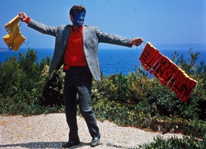
Film Colors
April 9 to May 7, 2010
“Color in film always made trouble”, Frieda Grafe writes. “It did not harmonize easily with the hi-fi realism of cinema. It lent an aura to the images on screen, an impression of luxury.” Color worked in a realm beyond plot, beyond reason: it was excessive, seductive, a dark, magical power. Not coincidentally, color came to prominence in those genres already predisposed to an exuberant and unfettered flow of emotion: the musical and the melodrama, adventure and fantasy films. And it was only in the late 1960s, when both television news and mainstream cinema wholeheartedly adopted color that its meaning was transformed: color became less identified with the ‘spectacular’ and the ‘constructed’ and more closely linked to ‘realism.’
The retrospective Film Colors is the first major presentation of the subject in Austria – from early, hand-painted films and Pathé’s stencil-colored féeries through the great era of Technicolor (and the appearance of its less expensive successor Agfa/Eastmancolor) up to the magnificent color experiments of modern Italian and French cinema. These latter films reflect – as do some of their Hollywood predecessors – the ‘commercial color’ schemes of the fifties and sixties: cinematic Pop Art and Op Art, the new realms of acrylic, candy, and psychedelic colors.
The program will present 35 feature films and close to 50 color-drenched animated, live-action, and avant-garde shorts, including some digital work. The selection ranges from Oskar Fischinger, Walt Disney and Veit Harlan’s Opfergang to examples from Japan and from Bollywood cinema. It begins in 1900 and stretches to the early 21st century: Alain Resnais’ latest work, Wild Grass (2009), a truly magnificent example of contemporary work with color, will receive its Austrian premiere as part of the retrospective.
Today, nearly every film is in color. Yet conscious and bold color design remains the exception rather than the rule. One can now hardly appreciate the aesthetic, technical, and financial efforts once made on behalf of film color. It was the “fourth dimension” of film: at their creative peak, nearly all of cinema’s elite were intensely engaged with color. Yet, given the difficulty of describing its effects, film critics and historians have been content for the most part to ignore it: there are hardly any significant theorizations of cinematic color. The writings of German author Frieda Grafe stand out as a rare highlight. Film Colors is named after the first volume of her collected works (Filmfarben) and is guided by her predilections and observations on the topic.
One of Grafe’s main issues also stands at the center of Chromophobia, David Batchelor’s groundbreaking study on the fear of color in western culture. Both writers demonstrate how for centuries dominant discourse has devalued color: through its association with “alien” traits (i.e., feminine, gay, Oriental, primitive, infantile, vulgar, pathological), or through the identification with “unworthy” qualities – superficial, cosmetic, inauthentic, subordinate. Cinema always had to defend itself against similar charges, so it seems fitting that it embraced the utopian potential of color: In films, the “fall into color”, so feared by the western super-ego, is often the first step towards a richer, more passionate experience of life – from The Wizard of Oz (1939) and The Red Shoes (1948) to Pleasantville (1998) or Punch-Drunk Love (2002).
Early on, the Kodak company adopted highly evocative terms to describe the subtle nuances of color film chemistry: “Peachblow”, “Aquagreen,”, “Purplehaze”, “Nocturne” and many more. The retrospective is dedicated to their whole spectrum, and to all the virtuosos who were able to make it dance: avant-garde artists such as Sergej Eisenstein, Len Lye, Stan Brakhage, Marie Menken or Paul Sharits; animatiors like Georges Méliès, Max & Dave Fleischer, Chuck Jones or Norman McLaren; classical storytellers like Hitchcock, Renoir, Ozu, Hawks or Visconti; “Vulgar modernists” from the U.S., such as Vincente Minnelli, Frank Tashlin, Jerry Lewis and Douglas Sirk, or European auteurs like Antonioni, Bergman, Godard, Tati, Rohmer or Fassbinder, who rescued color from ordinariness, in subtle and sometimes not-so-subtle ways, taking inspiration from Matisse to Rothko to Warhol.
These star players on the stage of Film Colors are joined by many nearly-anonymous participants – those fascinating, often short-lived techniques and processes that have accompanied the development of color film. These will also be brought to light in this show – the British “Kinemacolor” (starting in 1906) and Gaumont’s three-color “Chronochrome” (1912), the Lumière brothers’ “Lumicolor” and other the 1930s inventions like “Dufaycolor” and “Gasparcolor”, or “Kodachrome,” celebrated by many independent filmmakers as the all-time champ as far as film colors go. Their moment was fleeting, just as the attempt to fully preserve color (or to retain its memories) is always elusive. Many prints in this show are the result of major restoration projects, others date back to the original release period (in the case of highly stable IB Technicolor prints). But none of these wonderful objects will ever show their true colors. There is no single truth to film color: it shines, disintegrates, and returns in a different light – it goes the way of all life. As with every feast or celebration, what matters here is to seize the day, and be aware of each moment.
Related materials
Program Technicolor - April / May 2015


